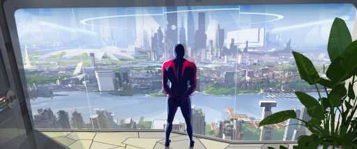
Production designer Patrick O’Keefe drew inspiration from brutalist architecture, graphic artist Syd Mead and British punk band The Sex Pistols when animating the world of “Spider-Man: Across the Spider-Verse.”
As Miles Morales crosses path with different Spider-People from other dimensions, it was up to O’Keefe and his team of animators to create visual worlds that reflect those counterparts.
With Variety, he breaks down the looks of each world and shares his favorite easter eggs that pay homage to the Canadian animators who worked on the film.
Earth 928

“Whenever it comes to developing anything for the film, I’m always asking myself, whose point of view are we seeing this from? And what does it need to do?
In animation, we have this awesome opportunity because we don’t have to take the look of the world around us for granted, it can be anything we want. We’re going to create this thing from scratch.
We began by asking ‘Who is Miguel O’ Hara?’ (voiced by Oscar Isaac, a Spider-Man who lives in the futuristic Nueva York in the year 2099).
He is this character of exacting precision. He’s got a lot of strength. He’s got this underlying structure that is infallible, from his point of view. And he needs to control the whole universe.
In looking at the source material, the character of Spider-Man 2099, was created by Rick Leonardi and Peter David, and they embodied this futuristic world. It’s dated by today’s standards, but we wanted to celebrate the origins of where the character came from. So we leaned into retro-futurism.
Miguel, also represents the old guard compared to Miles. So by combining, the look and ambitions of the original creators, we went back and looked at the artists of the time. We looked at Syd Mead and Ralph McQuarrie. We also looked at some of my favorite painters like, and some of my favorite painters John Berkey and John Harris, these illustrators that got their start before concept art was a thing.
They’re all industrial designers, term concept artists, so we looked at their tools. They used protractors and geometry sets, these are mathematically planned out environments that Miguel truly embodies.
We also wanted to bring a lot of that Latin American influence into it as well. So, we looked at Austin Niemeyer, but he’s an architect who designed the city of Brasilia. It’s a highly controlled environment that Miguel wants to inhabit, so his world reflects that.
A lot of sci-fi is dark, moody and mysterious. We went with bright blue skies and a super clean white city that leans into this brutalist and authoritarian style of design. It’s quite minimalist because they’re presenting this clean, strong, unified, front-facing ideology.
Behind that, there are these dark secrets that are eventually going to come to light and as we slip underground, and get a true understanding of what’s going on. We see it’s a world they can’t actually control.”
Spider-Punk

“Spider-Punk doesn’t have an introduction, he interrupts the film, and kind of kicks the door in. The big thing for us was capturing the essence and eccentricities of the ‘70s punk scene in London.
We went back to the raw materials that were being used. We had our artists create newspapers. I had a chance to go to London and take tons of photos. We were cutting them up using razor blades, scissors and taping them back together so that they looked like a setlist, a zine or a punk poster.
We looked at the Sex Pistols, the Buzzcocks and My Chemical Romance. Those actual poster color combinations all show up on Spider-Punk but within his world.”
Homage to Canadian Hockey
“There’s one easter egg that made me proud as a Canadian, and we work with Sony Pictures Imageworks, which is based out of LA but also Vancouver. So we have this overwhelming amount of Canadians on the film. She became this joke, and she starts popping up everywhere as a background character. It’s a personal favorite because it’s a shout-out to many of the creators of the film, and the great country a lot of us come from.
We needed a new spider created wholly-owned for our film. Character designer Kris Anka and I came up with the idea of Spider-Woman Canada. She is a hockey stick-wielding skate-wearing Spider. Her jersey is inspired by the Summit Series Canadian hockey jerseys when Canada played the U.S.S.R for hockey world supremacy. “
Read More About:
Source: Read Full Article


